The Report
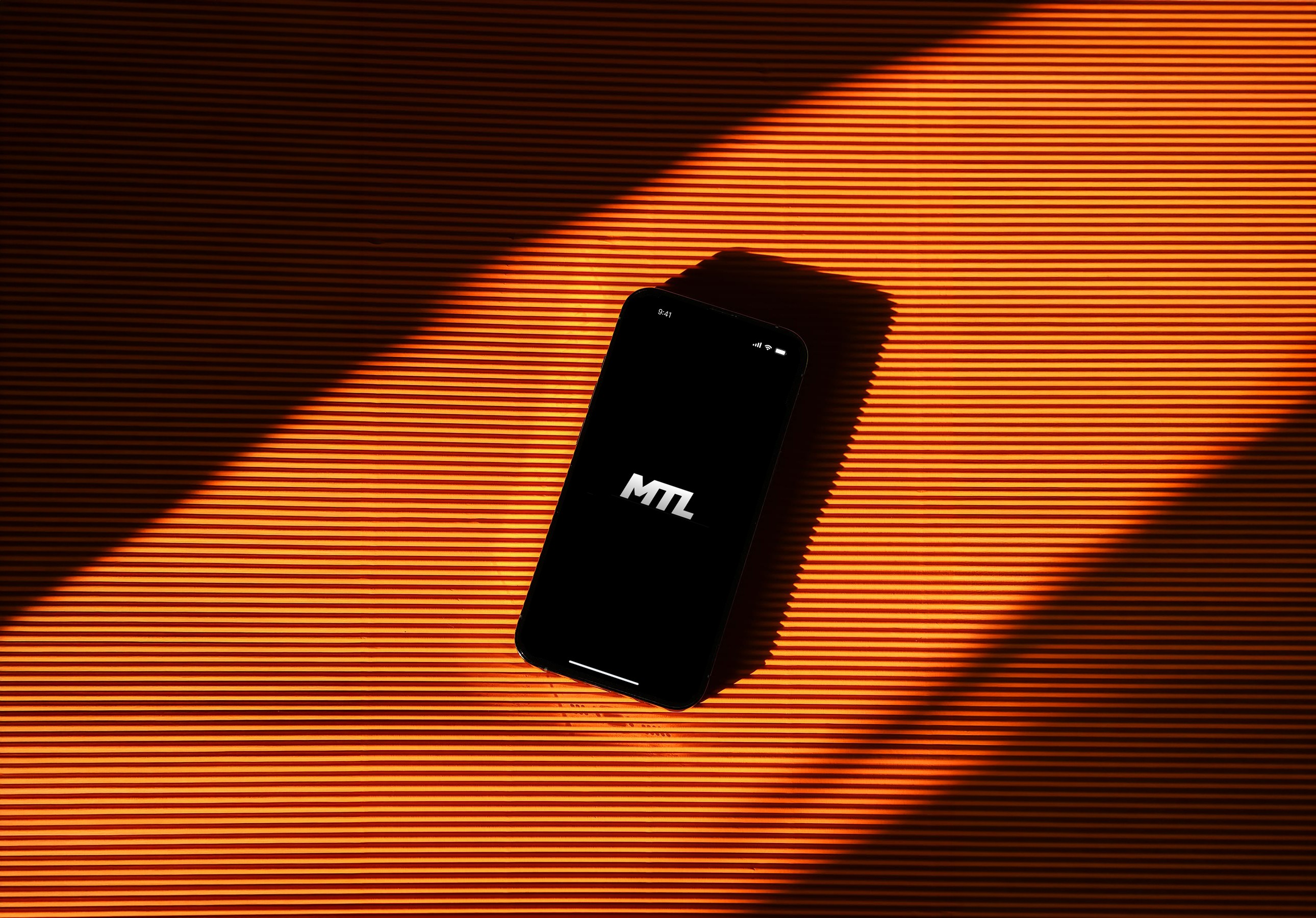
A working surf conditions web app built with Claude AI — no engineering team required.
A working surf conditions web app built with Claude AI — no engineering team required.


overview
The Shift Is Already Happening
For most of my career as a designer, my work ends at the prototype. I hand off a Figma file, an engineer picks it up, and somewhere in that handoff things get lost — timing, nuance, interactions that felt alive in the prototype fall flat in the build.
But I started wondering: what if it didn't have to be?
AI tools like Claude have started to close the gap between design and engineering in a real way. Not in a "AI will replace designers" way — but in a "a designer who understands how to work with AI can now ship things they never could before" way. I wanted to test that.
Tive is a supply-chain visibility company that provides real-time shipment tracking for logistics teams worldwide. Their web platform delivers critical data – location, temperature, humidity, shock, route deviations, and alerts – to help users keep shipments safe and respond quickly when something goes wrong.
However, despite the strength of their web platform, Tive did not have a mobile experience. For a product built around real-time visibility, this created a major gap:
Users often needed quick access while traveling, working on the warehouse floor, or managing shipments away from their desk.
The lack of a mobile interface made fast, in-the-moment decisions more difficult than necessary.
Core functionality wasn’t easily accessible in contexts where mobility is essential.
Timeline
72 Hours
My Role
Product Design, Development (AI-assisted)
Solving the NH Paradox
As a surfer, I faced a recurring frustration: the New Hampshire coastline (my hometown) is highly variable, and a "good" day at one beach rarely guarantees the same conditions just a few miles away.
My pre-session ritual involved a high-friction process of manually checking disparate sources – offshore buoys, wind apps, and tide charts – and attempting to perform the "mental math" to guess where to go. Too often, this fragmented data led to "false starts" and wasted time driving to spots that didn't live up to the data.
I created The Report as a personalized solution to handle all that heavy lifting for me. By translating raw data into a simple ranking system for my favorite local spots, I built a tool that cuts out the guesswork – saving me the drive and helping me spend more time in the water and less time in my truck.

project goals
Core Objectives
I approached this project as a full product build rather than a design exercise. My goal was to validate whether I could take a concept to a near market-ready state independently – using AI to extend beyond traditional design workflows and replace the need for dedicated engineering support.
That meant translating ideas into a functional system, not just an interface. I worked with live data integrations, defined and implemented scoring logic, and structured the product to operate reliably in real time. Every decision was grounded in whether the product could actually perform, not just how it looked.
Goals
Validate AI-assisted, engineer-independent product development
Implement real-time data and functional scoring logic
Have fun
process
Intentional Constraints
I began the project in Figma with a strict focus on core functionality. My objective wasn't to build an all-encompassing surf platform, but rather to create a near-market-ready, functional tool that solved a specific problem for the New Hampshire coastline.
By keeping the initial feature set lean, I was able to focus on the "Goldilocks" zone of product design: a simple enough scope to actually ship, but high enough quality to be immediately useful.
The scoped feature set landed on:
A three-screen architecture: Today, Spots, and Forecast – each with one clear job.
Regional focus: 16 hand-picked breaks along the NH Seacoast, nothing more.
A single quality score: Every spot gets a 0–100 rating so you can scan conditions at a glance.
I began the project in Figma with a strict focus on core functionality. My objective wasn't to build an all-encompassing surf platform, but rather to create a near-market-ready, functional tool that solved a specific problem for the New Hampshire coastline.
By keeping the initial feature set lean, I was able to focus on the "Goldilocks" zone of product design: a simple enough scope to actually ship, but high enough quality to be immediately useful.
The scoped feature set landed on:
A three-screen architecture: Today, Spots, and Forecast—each with one clear job.
Regional focus: 16 hand-picked breaks along the NH Seacoast, nothing more.
A single quality score: Every spot gets a 0–100 rating so you can scan conditions at a glance.
Translating Designs
The heart of this project was a back-and-forth process with Claude Code, turning Figma mockups into a working Next.js app. I didn't just hand things off and hope for the best – we built it up in layers. I walked through the architecture one component at a time, giving Claude the context it needed to understand how each piece fit into the bigger picture. The translation from Figma to Claude Code wasn't perfect, but it's pretty darn close.
On the technical side, here's what came together:
Live Data Integrations: Three distinct API streams—NOAA’s ocean buoy network, the Open-Meteo weather API, and NOAA’s Tides & Currents service.
The "Best Day Pick": A predictive feature that identifies the specific window when a spot will peak, rather than just showing current conditions.
CI/CD Pipeline: A full deployment workflow managed through GitHub and Vercel.
Designing the Algorithm
The most significant design challenge wasn't visual—it was the algorithm. On the NH Seacoast, surf quality is deeply local; a "good" day at one break can be unrideable at another just miles away. A generic global score wouldn't work, so I built a scoring engine that treats each of the 16 spots as a unique profile.
Each spot is configured with its own "ideal" window for swell direction, swell size, wind orientation, and tide state. The engine evaluates live data against these specific profiles to produce a 0–100 score based on four weighted components:
Swell Direction & Period (43%): The primary foundation of surf quality.
Wave Size (35%): The physical scale of the conditions.
Wind Quality (22%): How well the local wind "grooms" the waves.
Tide Multiplier: A dynamic layer that rewards ideal tide windows and penalizes unfavorable ones.
overview
The Shift Is Already Happening
For most of my career as a designer, my work ends at the prototype. I hand off a Figma file, an engineer picks it up, and somewhere in that handoff things get lost — timing, nuance, interactions that felt alive in the prototype fall flat in the build.
But I started wondering: what if it didn't have to be?
AI tools like Claude have started to close the gap between design and engineering in a real way. Not in a "AI will replace designers" way — but in a "a designer who understands how to work with AI can now ship things they never could before" way. I wanted to test that.
Timeline
72 Hour
My Role
Product Design, Development (AI-assisted)
Solving the NH Paradox
As a surfer, I faced a recurring frustration: the New Hampshire coastline (my hometown) is highly variable, and a "good" day at one beach rarely guarantees the same conditions just a few miles away.
My pre-session ritual involved a high-friction process of manually checking disparate sources – offshore buoys, wind apps, and tide charts – and attempting to perform the "mental math" to guess where to go. Too often, this fragmented data led to "false starts" and wasted time driving to spots that didn't live up to the data.
I created The Report as a personalized solution to handle all that heavy lifting for me. By translating raw data into a simple ranking system for my favorite local spots, I built a tool that cuts out the guesswork – saving me the drive and helping me spend more time in the water and less time in my truck.
solution
It works!
The first screen answers the most important question: where should I surf right now?
At the top is Today's Top Pick — a card that surfaces the single best spot to surf that day, not based on current conditions alone, but based on when that spot is projected to peak. The algorithm looks ahead at the full day's tide cycle and identifies the window when each spot's score will be highest, then elevates whichever spot has the best ceiling. A spot scoring a 23 at 7am but a 78 at noon ranks higher than one that's mediocre all day.
Below the top pick, the screen surfaces the broader conditions for the day — wind speed, gusts, swell height, period, and direction, plus a live tide chart showing how the tide will move from morning to night. This data isn't tied to any single spot; it's the full picture of what the ocean is doing that day, giving surfers the context they need to make their own read on conditions.

project goals
Intentional Constraints
I began the project in Figma with a strict focus on core functionality. My objective wasn't to build an all-encompassing surf platform, but rather to create a near-market-ready, functional tool that solved a specific problem for the New Hampshire coastline.
By keeping the initial feature set lean, I was able to focus on the "Goldilocks" zone of product design: a simple enough scope to actually ship, but high enough quality to be immediately useful.
The scoped feature set landed on:
A three-screen architecture: Today, Spots, and Forecast—each with one clear job.
Regional focus: 16 hand-picked breaks along the NH Seacoast, nothing more.
A single quality score: Every spot gets a 0–100 rating so you can scan conditions at a glance.
Translating Designs
The heart of this project was a back-and-forth process with Claude Code, turning Figma mockups into a working Next.js app. I didn't just hand things off and hope for the best – we built it up in layers. I walked through the architecture one component at a time, giving Claude the context it needed to understand how each piece fit into the bigger picture. The translation from Figma to Claude Code wasn't perfect, but it's pretty darn close.
On the technical side, here's what came together:
Live Data Integrations: Three distinct API streams—NOAA’s ocean buoy network, the Open-Meteo weather API, and NOAA’s Tides & Currents service.
The "Best Day Pick": A predictive feature that identifies the specific window when a spot will peak, rather than just showing current conditions.
CI/CD Pipeline: A full deployment workflow managed through GitHub and Vercel.
Designing the Algorithm
The most significant design challenge wasn't visual – it was the algorithm. On the NH Seacoast, surf quality is deeply local; a "good" day at one break can be unrideable at another just miles away. A generic global score wouldn't work, so I built a scoring engine that treats each of the 16 spots as a unique profile.
Each spot is configured with its own "ideal" window for swell direction, swell size, wind orientation, and tide state. The engine evaluates live data against these specific profiles to produce a 0–100 score based on four weighted components:
Swell Direction & Period (43%): The primary foundation of surf quality.
Wave Size (35%): The physical scale of the conditions.
Wind Quality (22%): How well the local wind "grooms" the waves.
Tide Multiplier: A dynamic layer that rewards ideal tide windows and penalizes unfavorable ones.
Spots
The second screen answers: what's everything else looking like?
All 16 NH Seacoast breaks are listed and ranked by their current score, each displayed as a card with a 0–100 score ring and four condition chips — Wind, Swell, Tide, and Size — color-coded green, yellow, or red based on how well live conditions match that spot's profile. A surfer can scan the list in seconds and understand exactly where the coast stands at any given moment.
Each card also shows the spot's best window for the day, so even a spot that's mediocre right now might be worth checking back on later.
Forecast
The third screen answers: when should I plan to surf this week?
The Forecast tab shows a 5-day outlook with projected wave height, swell period, wind conditions, and an overall score for each day. It's built for the surfer who plans ahead — someone who wants to know whether Thursday or Saturday is the better call before they request time off or book a trip. No more checking five different apps the night before and trying to synthesize it yourself.
solution
It works!
The first screen answers the most important question: where should I surf right now?
At the top is Today's Top Pick — a card that surfaces the single best spot to surf that day, not based on current conditions alone, but based on when that spot is projected to peak. The algorithm looks ahead at the full day's tide cycle and identifies the window when each spot's score will be highest, then elevates whichever spot has the best ceiling. A spot scoring a 23 at 7am but a 78 at noon ranks higher than one that's mediocre all day.
Below the top pick, the screen surfaces the broader conditions for the day — wind speed, gusts, swell height, period, and direction, plus a live tide chart showing how the tide will move from morning to night. This data isn't tied to any single spot; it's the full picture of what the ocean is doing that day, giving surfers the context they need to make their own read on conditions.
reflection
What I Learned
Working with AI is a skill in itself
There's a learning curve to collaborating with AI that nobody really talks about. It's not about typing better prompts — it's about thinking in systems. The most important thing I learned is that the order in which you make requests matters enormously. If you ask Claude to build a feature before you've established the architecture it needs to live in, you create debt. The same way a design system built on a shaky foundation will eventually crack, a codebase built without intentional sequencing becomes harder to extend with every step.
The designers who will get the most out of AI aren't the ones who can write the cleverest prompts. They're the ones who can plan the work the way an engineer would — breaking it into layers, understanding how each piece depends on the others, and building in the right order.
Organization upfront saves you hours later
Early in the project, I made decisions about naming conventions, component structure, and how data would flow through the app. At the time it felt like overhead. Looking back, those decisions were load-bearing. Every feature I added later slotted in cleanly because the foundation was intentional. Every time I skipped that step, I paid for it.
This maps directly to how I think about design systems. The principles are identical — structure early, name things clearly, define how pieces talk to each other before you need them to.
I learned how to read and write basic code
I'm not an engineer, and I'm not pretending to be one. But I now have enough exposure to how things are actually built — what an API call is, what a component is, what it means to deploy something — that I can sit in a room with engineers and follow the conversation. I can ask better questions. I can understand the tradeoffs being discussed. That's a different kind of value than being able to write code, but it's real, and it compounds over time.
Spots
The second screen answers: what's everything else looking like?
All 16 NH Seacoast breaks are listed and ranked by their current score, each displayed as a card with a 0–100 score ring and four condition chips — Wind, Swell, Tide, and Size — color-coded green, yellow, or red based on how well live conditions match that spot's profile. A surfer can scan the list in seconds and understand exactly where the coast stands at any given moment.
Each card also shows the spot's best window for the day, so even a spot that's mediocre right now might be worth checking back on later.
Forecast
The third screen answers: when should I plan to surf this week?
The Forecast tab shows a 5-day outlook with projected wave height, swell period, wind conditions, and an overall score for each day. It's built for the surfer who plans ahead — someone who wants to know whether Thursday or Saturday is the better call before they request time off or book a trip. No more checking five different apps the night before and trying to synthesize it yourself.
reflection
What I Learned
Working with AI is a skill in itself
There's a learning curve to collaborating with AI that nobody really talks about. It's not about typing better prompts — it's about thinking in systems. The most important thing I learned is that the order in which you make requests matters enormously. If you ask Claude to build a feature before you've established the architecture it needs to live in, you create debt. The same way a design system built on a shaky foundation will eventually crack, a codebase built without intentional sequencing becomes harder to extend with every step.
The designers who will get the most out of AI aren't the ones who can write the cleverest prompts. They're the ones who can plan the work the way an engineer would — breaking it into layers, understanding how each piece depends on the others, and building in the right order.
Organization upfront saves you hours later
Early in the project, I made decisions about naming conventions, component structure, and how data would flow through the app. At the time it felt like overhead. Looking back, those decisions were load-bearing. Every feature I added later slotted in cleanly because the foundation was intentional. Every time I skipped that step, I paid for it.
This maps directly to how I think about design systems. The principles are identical — structure early, name things clearly, define how pieces talk to each other before you need them to.
I learned how to read and write basic code
I'm not an engineer, and I'm not pretending to be one. But I now have enough exposure to how things are actually built — what an API call is, what a component is, what it means to deploy something — that I can sit in a room with engineers and follow the conversation. I can ask better questions. I can understand the tradeoffs being discussed. That's a different kind of value than being able to write code, but it's real, and it compounds over time.
The designer-engineer relationship is changing
Not disappearing — changing. The designers who will be most valuable in the next five years aren't the ones who can replace engineers with AI. They're the ones who can bridge the gap: who understand enough about how things are built to design things that are actually buildable, who can prototype at higher fidelity, and who can communicate more precisely because they've been on both sides of the handoff.
That's what I was trying to learn. I think I'm getting there.
work
say hello
i know you won't, but
feel free to say what's up!
i know you won't, but feel free to say what's up!
work