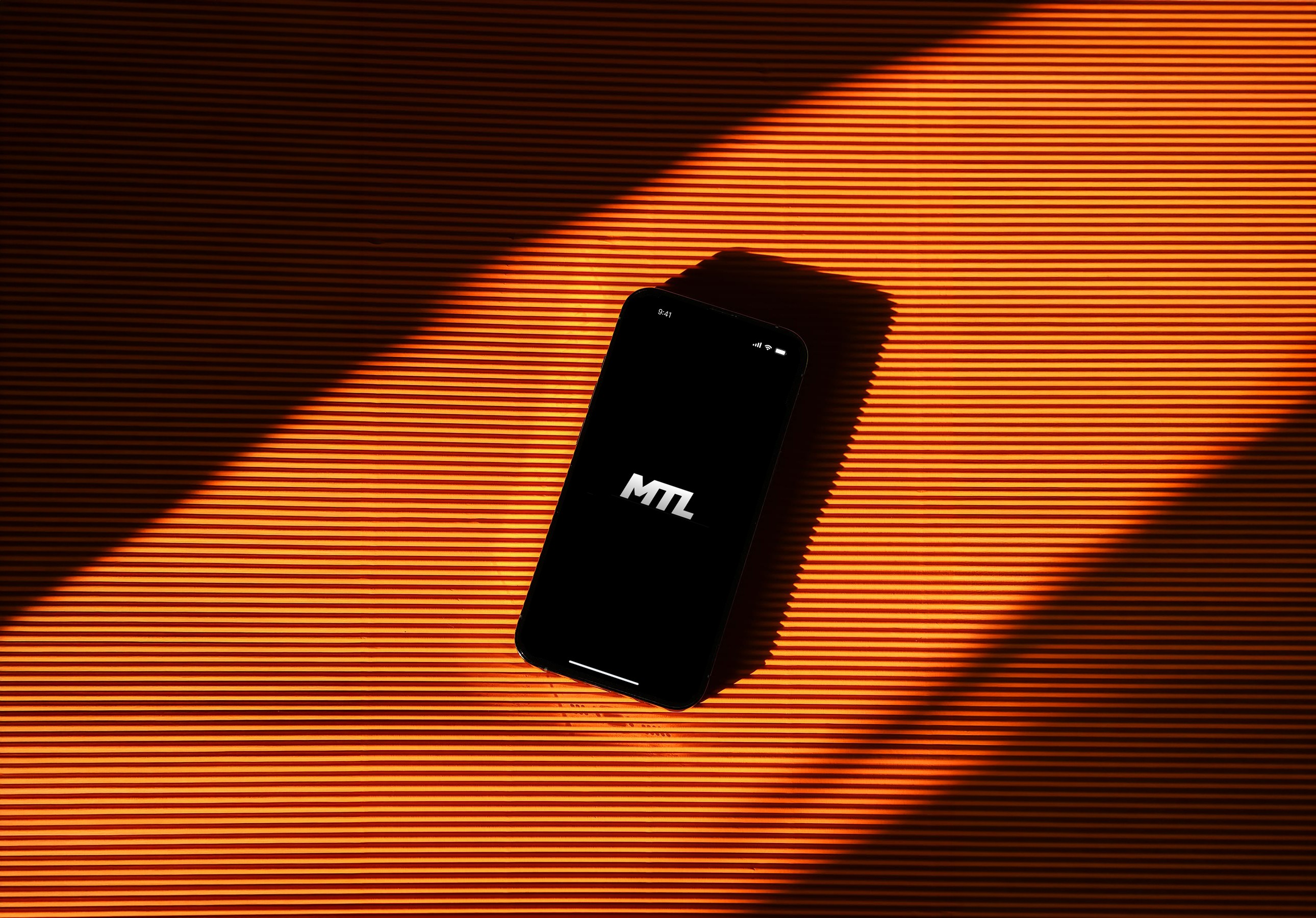
Monster Teaser
League (MTL)
A fantasy sports startup with a mission to introduce a fresh, innovative game to the market.
A fantasy sports startup with a mission to introduce a fresh, innovative game to the market.
overview
What is MTL?
Monster Teaser League (MTL) is a fantasy sports startup built around a new and innovative style of gameplay. With a growing community of around 1,500 users, the company recognized the need to redesign its app to support future growth and improve the overall experience.
Over two months, my team of four led a full product redesign, analyzing user feedback, behaviors, and pain points. Our goal was to simplify the experience, modernize the interface, and make the game easier to understand and manage.
Timeline
April 2024- June 2024 (2-months)
My Role
Design Lead - Ideation Workshops, Usability Testing, High-Fidelity Prototype, Research, Design System
research
Speaking to Users
MTL has two primary user types: players and commissioners (who are also players). To understand the needs and pain points of each group, we structured our research accordingly, conducting interviews with five players and five commissioners. We also conducted usability tests to establish baseline metrics for future comparison.
After synthesizing our interview notes and usability test results, we grouped recurring themes and patterns across participants. This process allowed us to distill our findings into three key pain points that guided the design direction:
Baseline Metrics
3 minutes and 19 seconds was the average time to understand the rules.
Only 40% of participants explained the rules without errors.
2.4 out of 5 was the average score for ease of learnability
Usability & Learnability
Users found the interface cluttered and the navigation unintuitive, making the product difficult to learn. Even after playing, many users struggled to understand where key features lived or how the system worked.
Commissioners Corner
The “Commissioner’s Corner” in MTL isn’t very useful in its current form. Commissioners only use it at the beginning of the season to invite players and again at the end to review standings.
The “Commissioner’s Corner” in MTL isn’t very useful in its current form. Commissioners only use it at the beginning of the season to invite players and again at the end to review standings.

Getting Started
Both commissioners and players described the sign-up process as tedious and confusing. The game itself also has a learning curve, making the early experience feel overwhelming for first-time users.


"Eventually I just stopped telling friends about MTL because it’s annoying to do so."
"Eventually I just stopped telling friends about MTL because it’s annoying to do so."
what is MTL?
Overview
Monster Teaser League (MTL) is a fantasy sports startup with a mission to introduce a fresh, innovative game to the market. With a growing user base of around 1,500 users, MTL recognized the need to revamp its app to prepare for future growth.
Over the course of two months, my team of four embarked on an ambitious redesign project, diving deep into user feedback, behaviors, and pain points to create a modern, user-centric design that would elevate the overall user experience.
Timeline
April 2024- June 2024 (2-months)
My Role
Design Lead - Ideation Workshops, Usability Testing, High-Fidelity Prototype, Research, Design System
ideation
A team effort
To redesign the MTL experience, we applied a Double Diamond framework, navigating through iterative cycles of discovery and definition to ensure every feature addressed a validated player need. This approach allowed us to move from broad exploration to focused execution across the following four key workstreams:
Information Architecture
We audited the existing product to identify navigation bottlenecks and overlapping content, then reorganized the structure into a simplified global navigation system.
Exploration & Concepting
We ran a three-day sketching workshop to rapidly explore layout directions and map new user flows. My sketches from this exercise can be seen below.
Feature Prioritization
Through our interviews we defined a “Must Do” feature set and prioritized high-impact improvements such as live match interaction and customizable alerts.
Usability Testing
We audited the existing product to identify navigation bottlenecks and overlapping content, then reorganized the structure into a simplified global navigation system.
solution
Onboarding Solution
Explaining MTL was a huge barrier for growth - even now, I still struggle to explain it to my friends. However, the results from testing our tutorial were outstanding.
Metrics
1m 26s was the average comprehension time, a 60% decrease.
100% success rate achieved in explaining rules, a 60% increase.
4.3/5 was the score for ease of learnability, a 39% increase.
speaking to users
Research
MTL has two primary user types: players and commissioners (who are also players). To understand the needs and pain points of each group, we structured our research accordingly, conducting interviews with five players and five commissioners. We also conducted usability tests to establish baseline metrics for future comparison.
After synthesizing our interview notes and usability test results, we grouped recurring themes and patterns across participants. This process allowed us to distill our findings into three key pain points that guided the design direction:
Baseline Metrics
3 minutes and 19 seconds was the average time to understand the rules.
Only 40% of participants explained the rules without errors.
2.4 out of 5 was the average score for ease of learnability
After synthesizing our interview notes and usability test results, we grouped recurring themes and patterns across participants. This process allowed us to distill our findings into three key pain points that guided the design direction:
Navigation + Learnability
Users found the interface cluttered and the navigation unintuitive, making the product difficult to learn. Even after playing, many users struggled to understand where key features lived or how the system worked.
Commissioners Corner
The “Commissioner’s Corner” in MTL isn’t very useful in its current form. Commissioners only use it at the beginning of the season to invite players and again at the end to review standings.
Sign Up Process
Both commissioners and players described the sign-up process as tedious and confusing. The game itself also has a learning curve, making the early experience feel overwhelming for first-time users.
ideation
A team effort
To redesign the MTL experience, we applied a Double Diamond framework, navigating through iterative cycles of discovery and definition to ensure every feature addressed a validated player need. This approach allowed us to move from broad exploration to focused execution across the following four key workstreams:
Information Architecture
We audited the existing product to identify navigation bottlenecks and overlapping content, then reorganized the structure into a simplified global navigation system.
Feature Prioritization
Through our interviews we defined a “Must Do” feature set and prioritized high-impact improvements such as live match interaction and customizable alerts.
Exploration & Concepting
We ran a three-day sketching workshop to rapidly explore layout directions and map new user flows. My sketches from this exercise can be seen below.
Usability Testing
We audited the existing product to identify navigation bottlenecks and overlapping content, then reorganized the structure into a simplified global navigation system.
Make Picks & Gameday
Explaining MTL was a huge barrier for growth - even now, I still struggle to explain it to my friends. However, the results from testing our tutorial were outstanding.
Picks Tab
This is exactly as it sounds - the place where playing go to make their weekly picks. We reworked the flow, and added the ability to click into a matchup to allow users to get team info to better inform their picks.
Gameday
This is a place for users to see how not only their picks are doing, but also how other players in the league are doing as well. Green is covering, yellow is close, and red is not covering. The more red you see with your friends, the better - root for red!
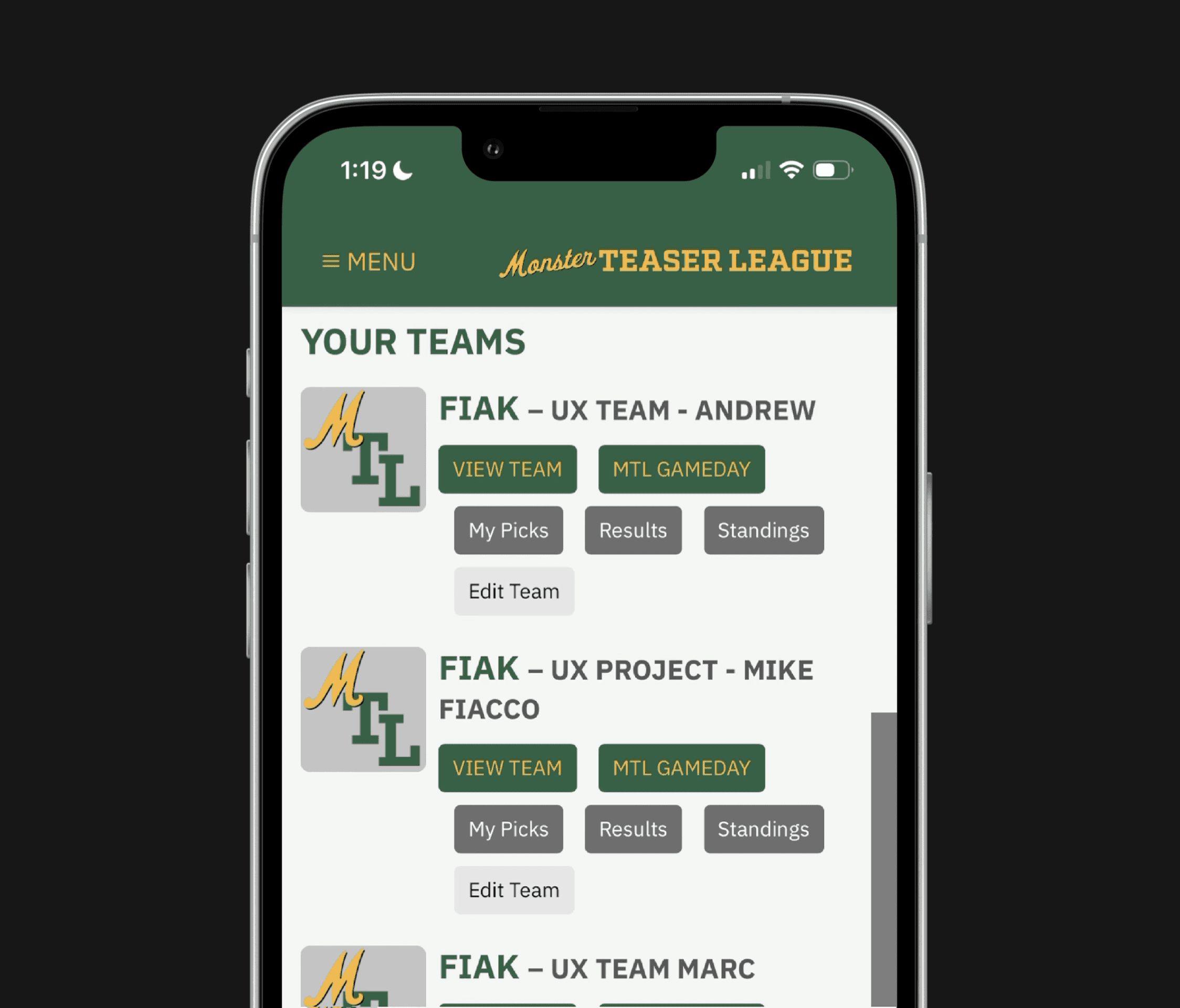
Dashboard
This is the landing page for your league. We wanted the dashboard to incorporate the three main functions users taking while using the MTL app.
Making Picks
Users can opt to make this weeks picks, while also having the ability to view their pick history.
Results & Standings
Weekly results are front and center. See how you and your friends did this past week, while also noting who the top 3 players in the league currently are.
Gameday
View live and upcoming games. Click on cards to get more details about the game itself, and which of your friends have picked them.
Comissioners Corner
We developed a bifurcated League Interface: a Public View for universal access to rules and player data, and a Privileged Admin Dashboard. This empowers Commissioners to manage the league’s lifecycle through tools for rule-setting, direct player engagement, and roster maintenance.
solution
Onboarding Solution
Explaining MTL was a huge barrier for growth - even now, I still struggle to explain it to my friends. However, the results from testing our tutorial were outstanding.
Metrics
1m 26s was the average comprehension time, a 60% decrease.
100% success rate achieved in explaining rules, a 60% increase.
4.3/5 was the score for ease of learnability, a 39% increase.
reflection
What I Learned
Outline your goals early, and stick to them.
Taking on a project like this offers countless opportunities, challenges, and potential solutions. It's easy to stray off course and lose sight of the initial goals. Through this experience, I've learned the importance of keeping my objectives at the forefront of my daily tasks.
Make sure your decisions are backed by data.
Making decisions backed by data is crucial because it leads to the creation of products that are genuinely user-centered and more likely to succeed. Additionally, data-driven decisions make it easier for clients to understand and support your work.
Dashboard
This is the landing page for your league. We wanted the dashboard to incorporate the three main functions users taking while using the MTL app.
Making Picks
Users can opt to make this weeks picks, while also having the ability to view their pick history.
Results & Standings
Weekly results are front and center. See how you and your friends did this past week, while also noting who the top 3 players in the league currently are.
Gameday
View live and upcoming games. Click on cards to get more details about the game itself, and which of your friends have picked them.
Make Picks & Gameday
Picks Tab
This is exactly as it sounds - the place where playing go to make their weekly picks. We reworked the flow, and added the ability to click into a matchup to allow users to get team info to better inform their picks.
Gameday
This is a place for users to see how not only their picks are doing, but also how other players in the league are doing as well. Green is covering, yellow is close, and red is not covering. The more red you see with your friends, the better - root for red!
Comissioners Corner
We developed a bifurcated League Interface: a Public View for universal access to rules and player data, and a Privileged Admin Dashboard. This empowers Commissioners to manage the league’s lifecycle through tools for rule-setting, direct player engagement, and roster maintenance.
reflection
What I Learned
Outline your goals early, and stick to them.
Taking on a project like this offers countless opportunities, challenges, and potential solutions. It's easy to stray off course and lose sight of the initial goals. Through this experience, I've learned the importance of keeping my objectives at the forefront of my daily tasks.
Make sure your decisions are backed by data.
Making decisions backed by data is crucial because it leads to the creation of products that are genuinely user-centered and more likely to succeed. Additionally, data-driven decisions make it easier for clients to understand and support your work.
work

say hello
i know you won't, but
feel free to say what's up!
i know you won't, but feel free to say what's up!

work